Thursday, October 24, 2013

The Art of Critique

Intro to Drawing and Painting

Take a look at Chagall's Painting called "I and the Village" again.  You will do the first part of the four steps of critiquing, Describe.  Take your time and refer to the Elements of Design document as you go through this process.


1. Describe what you see. This is the objective (not subjective or personal) portion of the Art Critique. Objective information or analysis is fact-based where as subjective information is based on personal opinions, interpretations, points of view, emotions & judgment.
Objective Information involves a technical description-nothing more. It should include things like:
ü  Artist's name.
ü  Title of work.
ü  Type of artwork.
ü  Subject of the painting (scene).
ü  Objects in the painting.
ü  First impression. Note the characteristics of the artwork that first jump out at you.
ü  Colors used.
ü  Shapes, lines and texture.
ü  Light saturation.
ü  Sensory qualities. Identify the predominant mood and visual effect.


Tuesday, October 22, 2013

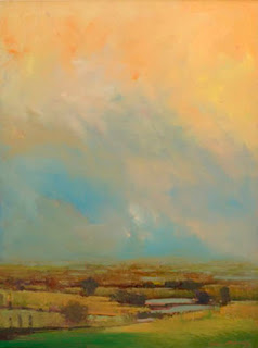
Sky Land COLOR

Advanced Drawing and Painting


"Each of these luminous and mysterious images of trees against sky, field, and river evoke a subtle variation of light and atmosphere. The arrangement of the trees - whether standing in solitude or in pairs or in large groupings seem at once inevitable and yet surprising, formal yet accidental. All of these paintings are comprised from memory, imagination and thumbnail sketches from my beautiful basement studio in my home in Connecticut. I work on wood board, paper and canvas using several layers of gesso before priming the surface with cadmium red base, a quick sketch using charcoal is used to lay out the design then the paint is applied. I work in layers using thinned down oil color, building on these layers with glazing techniques the colors are adjusted and brought up to completion before final coats of varnish are applied. Light has come to play an important part, and when I look back over this body of work, I feel it speaks about spiritual places, places that contain a quiet inner light, radiating an ethereal whisper, the places we see every day."
- William McCarthy


Your next assignment is to create an acrylic landscape that experiments with the layering of color to create a luminous atmosphere.   William McCarthy takes photographs and draws thumbnail sketches of landscapes that have an appealing composition or beautiful lighting.  He then goes back to the studio and creates a landscape that may or may not be representational.  Some artists would prefer only to paint outside looking at the natural world and how the sun affects it, there are many ways to create a landscape or seascape. You can be inspired by a sunset, but not want to duplicate it.  There is no right or wrong way to approach drawing a natural setting it would be ideal to pause the perfect sunset so you can paint what you are seeing, but you can't.  
For this project focus on:
  • ·         Creating a composition that has at least 60 percent sky so the horizon line falls below the center of your piece.  This will allow you to focus on creating an interesting sky and you can layer colors in larger areas.

  • ·         Choose a color scheme that includes tints with accents of other more intense colors.

  • ·         Search for a landscape or seascape that inspires you, but that you aren’t “copying”.  You can use a photograph you or someone you know took.   You wont be duplicating them, but observing the colors, shapes, texture of the sky.  You can also combine images from a variety of photographs to create the one you like.  

  • ·         Abstract if you like.  This painting could be a very abstract one with barely any details if you choose, but you need to have a beginning reference.  


Sunday, October 20, 2013

Drawing a Portrait

Intro to Drawing and Painting


People are the most challenging and exciting subjects.  To become familiar with the features draw a self-portrait for your next sketchbook assignment. Stare at yourself in the mirror. Ask yourself:

  • What is the shape of my face?
  • How big of a forehead do I have?
  • How far apart are my eyes?
  • What is the shape of my eyes and how big are they related to the size of the space between my eyes?
  • How long and wide is my nose?
  • Is my top lip the same size as my bottom lip? Is it the same shape? Which lip is lighter?
This list could go on forever, the point is to keep asking yourself questions to help you understand proportions.  Take a look at the pictures below for some more initial guidelines. 


Hone your Drawing Skills

Advanced Drawing and Painting

Drawing a crushed can is a challenging task.  There will be complicated creases and folds to understand. The material (metal) reflects  light more than other objects creating many value changes.  After you find the can you would like to draw, crush it. Make it flat enough the you can keep it in your sketchbook or close by so when you have the time you can look at it. View the video below to help you see steps someone else took to complete the drawing.  This drawing will be due on 11/1.

Crushed-Can Drawing Video


Drawing from Columbus North High School Blog

What will make this drawing successful is getting everything in proportion, portraying the correct value changes, and paying close attention to detail.  So begin with observing the can.  What shape does it make now that it is crushed?  Draw that first, then slowly start to build up value changes. Try to have similar lighting when you draw the can. Most lights in rooms are directly above, but if there is a large window it may effect the highlights and shadows, if you begin with a contour drawing you can wait until you have a large chunk of time time to do the surface.  I am looking forward to seeing the final drawings.