Saturday, September 29, 2012

Wednesday, September 26, 2012

Tuesday, September 25, 2012

Creative Self-Portraits in Photoshop

Student Work Web Design

Students did an amazing job utilizing some image and text enhancing tools in Photoshop.  The most successful portraits took into account the negative and positive space, color scheme, and used f/x in a creative way.  I really love the way depth is created when transparencies and drop shadows are used.  Great work Web Design students.


"Extended" Drawing Lesson

Advanced Drawing and Painting
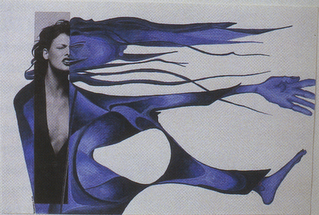
Artwork from: From Ordinary to Extraordinary by Ken Vieth
I came across this lesson on another teacher's website (thank you Mrs. Briggs).  It connects with the artists and styles we have been studying.  Start by perusing magazines until you find an image that jumps out at you.  Take a portion of that image and place it in your sketchbook (don't glue it down yet).  Extend the images by creating an interesting composition.  Think of the negative and positive space and how both define your sketch.  Create a few different examples of how you can complete this drawing.  After you have a solid composition and creative idea start planning your color scheme.  What mood are you trying to create?  Use either colored pencil, watercolor, and/or ink (or a combination of all three).  Remember to layer your materials to create depth in your piece.  Be thoughtful, creative, and invest yourself in you work!

Monday, September 24, 2012

Creating a Unique Creature...using Photoshop

Designing for the Web

There are tools in Photoshop that can make elephant skin look like lizard skin. In this lesson you will delve deeper into the magic of photoshop. Take a look at your next lesson to find out more.

Seasonal Still-Life

Intro to Drawing and Painting


This still-life is symmetrical (formally balanced), related by subject, has a variety of textures,
and the choice of colors create harmony.


A still-life is a grouping of inanimate (not moving or living) objects, arranged as a subject or reference for a work of art. Now that you are getting back into the swing of things after finishing your value charcoal drawings it is time to explore color!  You will be creating a pastel drawing of "seasonal" objects.  We will be taking into consideration how we arrange our objects to create an aesthetically pleasing and visually balanced still-life.  Below is a great definition of balance in art to help you better understand the concept.
 
"Balance can be symmetrical ("formal"), where elements are given equal "weight" from an imaginary line in the middle of a piece. For the most basic example of symmetry, think of your eyes in relation to either side of your nose.
Balance doesn't necessarily mean symmetry, though. Asymmetrical ("informal") balance occurs when elements are placed unevenly in a piece, but work together to produce harmony overall."


This still-life is asymmetrical, informally balanced. http://www.musicfromsalem.org/specialevents.html


Links to resources to help you learn more about balance and composition:


Working with Pastels

When I use pastels the most challenging thing for me is to keep it neat.  I tend to rest my hand on the paper (not a good idea) or I accidentally put something on the paper and it creates a smudge or mark.  The good thing about pastels if applied in light layers you can create depth and richness without damaging the tooth (surface texture) of the paper.  You can also deal with most "mistakes"  if you begin with planning your composition carefully by working it all out with thumbnail sketches.  There are many ways to create a pastel painting.  I will demonstrate a few in class but I would also like you to view the blog below. It shows examples and descriptions of the process the artist went through while creating her pastel painting. 
 
Here is a link to view the entire blog: 

Under drawing (blueprint)

Foundation (blocking in color)

Construction, building and layering color


Finishing Touches


Here are a couple other informative links: